

 2020-03-18

はじめに
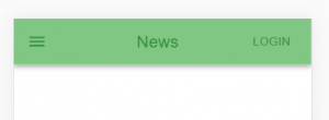
フロントまだまだよくわからないけれど、React+Typescript+Material-uiを使って、かっこいいWebアプリを作ろうとしてつまずいている初心者がMaterial-UIでコンポーネントの色を変えようとして四苦八苦したので、そのまとめです。 公式のドキュメントやサンプルコードを参考に色を変える方法として以下の3つでまとめました。
- Material-uiのPaletteを使う方法
- Paletteの色を変えたい
- style属性を使う方法
- className属性を使う方法
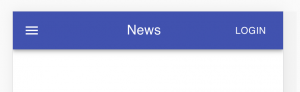
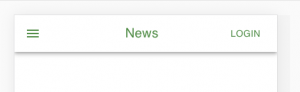
今回は以下のSimple App Barの色を変更していきます。 公式のサンプルコードはこちらです。
変更していくコードの概要
今回は説明の都合上、以下のコマンドを実行して、そのままApp.tsxを変更していきます。
npx create-react-app learn-material-ui --typescript
// material-uiのパッケージのインストール
yarn add @material-ui/core
yarn add @material-ui/icons
バージョンなどは以下です。
node.js:v10.16.0
"@material-ui/core": "^4.9.5",
"@material-ui/icons": "^4.9.1"App.tsxを公式のサンプルコードを参考に以下のように書き換えます。 これで実行すると上で紹介したスクリーンショットのようになります。
import React from "react";
import "./App.css";
import { createStyles, makeStyles, Theme } from "@material-ui/core/styles";
import AppBar from "@material-ui/core/AppBar";
import Toolbar from "@material-ui/core/Toolbar";
import Typography from "@material-ui/core/Typography";
import Button from "@material-ui/core/Button";
import IconButton from "@material-ui/core/IconButton";
import MenuIcon from "@material-ui/icons/Menu";

const useStyles = makeStyles((theme: Theme) =>
  createStyles({
    root: {
      flexGrow: 1,
      color: "#388e3c",
      backgroundColor: "#81c784"
    },
    menuButton: {
      marginRight: theme.spacing(2)
    },
    title: {
      flexGrow: 1,
      textAlign: "center"
    }
  })
);

function App() {
  const classes = useStyles();
  return (
    <div className={classes.root}>
      <AppBar position="static">
        <Toolbar>
          <IconButton
            edge="start"
            className={classes.menuButton}
            color="inherit"
            aria-label="menu"
          >
            <MenuIcon />
          </IconButton>
          <Typography variant="h6" className={classes.title}>
            News
          </Typography>
          <Button color="inherit">Login</Button>
        </Toolbar>
      </AppBar>
    </div>
  );
}

export default App;
Material-uiのPaletteを使う方法
一番単純なAppBarのcolorを利用する方法を紹介します。
コードの変更箇所は単純で以下のようにAppBarタグにcolorを追加するだけです。
<AppBar position="static" color="secondary">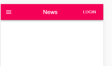
公式のドキュメントによると、AppBarのcolorは以下の要素に対応しているそうです。
defaultinheritprimarysecondarytransparent
「いやいや、この要素どれがなんなのかさっぱりわからないよ……」となったので、自分なりに調べてみたり実行したりした結果が以下です。
ちなみにブラウザの検証のElementsでAppBarの中を見ると、cssの中身が分かります。
default:モノクロ
inherit:親要素のcolorをinherit(サンプルコードでは親要素のdivに設定していたcolor: "#388e3c"が継承されました)
primary:デフォルトで設定されている。material-uiが用意しているDefault Themeのpaletteのprimary
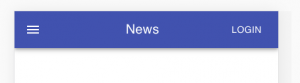
secondary:material-uiが用意しているDefault Themeのpaletteのsecondary
transparent:colorはinheritで、background-colorはtransparent(透過)
このなかのprimaryとsecondaryはmaterial-uiで色に統一感を持たせるためのPaletteというものの1つです。
様々なコンポーネントで利用されていて、コンポーネントごとに利用できるものが異なります。
デフォルトでは以下のような色が設定されています。
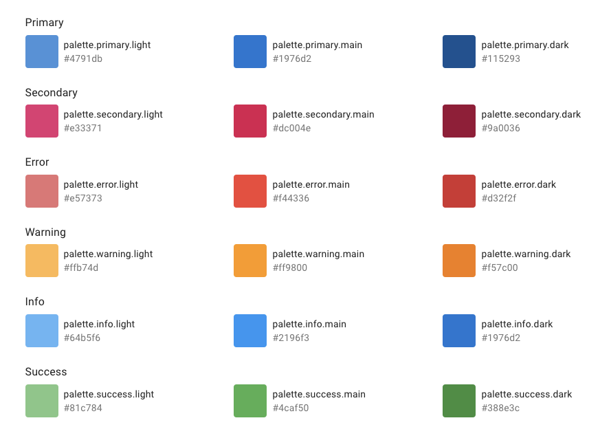
この色を変更する方法を次に紹介します。
Paletteの色を変えたい
アプリのイメージカラーで統一したいといったときにcreateMuiThemeとThemeProviderを利用します。
公式ページを参考にしつつ、コードを以下のように変更してみました。
import React from "react";
import "./App.css";
import { createStyles, makeStyles, Theme } from "@material-ui/core/styles";
import AppBar from "@material-ui/core/AppBar";
import Toolbar from "@material-ui/core/Toolbar";
import Typography from "@material-ui/core/Typography";
import Button from "@material-ui/core/Button";
import IconButton from "@material-ui/core/IconButton";
import MenuIcon from "@material-ui/icons/Menu";
import { createMuiTheme } from "@material-ui/core/styles";
import { teal } from "@material-ui/core/colors";
import { ThemeProvider } from "@material-ui/styles";
const useStyles = makeStyles((theme: Theme) =>
createStyles({
root: {
flexGrow: 1,
color: "#388e3c",
backgroundColor: "#81c784"
},
menuButton: {
marginRight: theme.spacing(2)
},
title: {
flexGrow: 1,
textAlign: "center"
}
})
);
// 追記
const theme = createMuiTheme({
palette: {
primary: {
main: teal[500]
},
secondary: {
main: "#00bcd4"
}
}
});
function App() {
const classes = useStyles();
return (
<ThemeProvider theme={theme}> // 追記
<div className={classes.root}>
<AppBar position="static" color="primary">
<Toolbar>
<IconButton
edge="start"
className={classes.menuButton}
color="inherit"
aria-label="menu"
>
<MenuIcon />
</IconButton>
<Typography variant="h6" className={classes.title}>
News
</Typography>
<Button color="inherit">Login</Button>
</Toolbar>
</AppBar>
</div>
<div className={classes.root}>
<AppBar position="static" color="secondary">
<Toolbar>
<IconButton
edge="start"
className={classes.menuButton}
color="inherit"
aria-label="menu"
>
<MenuIcon />
</IconButton>
<Typography variant="h6" className={classes.title}>
News
</Typography>
<Button color="inherit">Login</Button>
</Toolbar>
</AppBar>
</div>
</ThemeProvider> // 追記
);
}
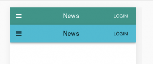
export default App;すると以下のように色を変更したAppBarを2つ表示することができました。
ちなみに@material-ui/core/colorsで、Materialデザインの色を利用することができます。
色の一覧はこのページを参照してみてください。
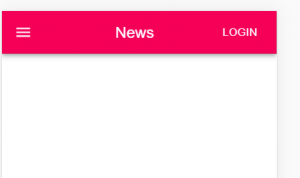
style属性を使う方法
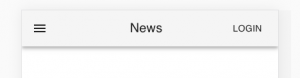
以下のようにAppBarタグを変更します。
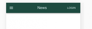
<AppBar position="static" style={{ color: "#e0f2f1", backgroundColor: "#004d40" }}>すると、以下のように色を変更することができます。
className属性を使う方法
まず、以下のようにuseStylesを書き換えます。
const useStyles = makeStyles((theme: Theme) =>
  createStyles({
    root: {
      flexGrow: 1,
      color: "#388e3c",
      backgroundColor: "#81c784"
    },
    bar: {
      color: "#e0f2f1",
      backgroundColor: "#004d40"
    },
    menuButton: {
      marginRight: theme.spacing(2)
    },
    title: {
      flexGrow: 1,
      textAlign: "center"
    }
  })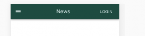
);次にAppBarタグを以下のように変更します。
<AppBar position="static" className={classes.bar}>すると、以下のようにstyle属性を使う方法と同じく書き換えることができます。
おわりに
Material-UIでコンポーネントの色を変える方法をまとめました。 Material-UI、とても便利なので使いこなしていきたいですね…! また、わかったことなどありましたら、まとめていきたいと思います。
この記事はQiitaにも投稿しています。


![Microsoft Power BI [実践] 入門 ―― BI初心者でもすぐできる! リアルタイム分析・可視化の手引きとリファレンス](/assets/img/banner-power-bi.c9bd875.png)
![Microsoft Power Apps ローコード開発[実践]入門――ノンプログラマーにやさしいアプリ開発の手引きとリファレンス](/assets/img/banner-powerplatform-2.213ebee.png)
![Microsoft PowerPlatformローコード開発[活用]入門 ――現場で使える業務アプリのレシピ集](/assets/img/banner-powerplatform-1.a01c0c2.png)